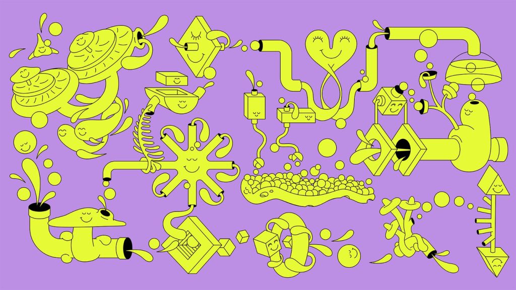
If, like us, you haven’t heard the term ‘Web3 cross-chain swap protocol’ before, don’t worry. After learning all about it on the recent Web3 brand Squid, Dad Agency gives us a rundown. “In a nutshell, Squid is a cross chain swap protocol meaning that people can easily swap assets [such as tokens] between different [block]chains [like Bitcoin or Ethereum], which was previously difficult and time-consuming.” This idea of a fluid, easy exchange is central to the design work the Amsterdam-Rotterdam agency has just unveiled for Squid. “Squid is like a river, with things flowing freely along it,” says the agency.With a brand name like Squid, the wordmark is suitably inky, with the river analogy represented through “organic and flowy” touches, Dad Agency describes. The same typographic style is mirrored in a custom monogram, and in a series of abstract flowing shapes that Dad Agency describes as “weaving” throughout the brand. To push the concept of exchange further, Dad Agency has introduced a series of illustrations showing mechanical processes interacting, with additional imagery and animation by Dave Renton.
Read More
Dad Agency turns to fun, flowy aesthetics to illustrate techy concepts for Web3 brand Squid