
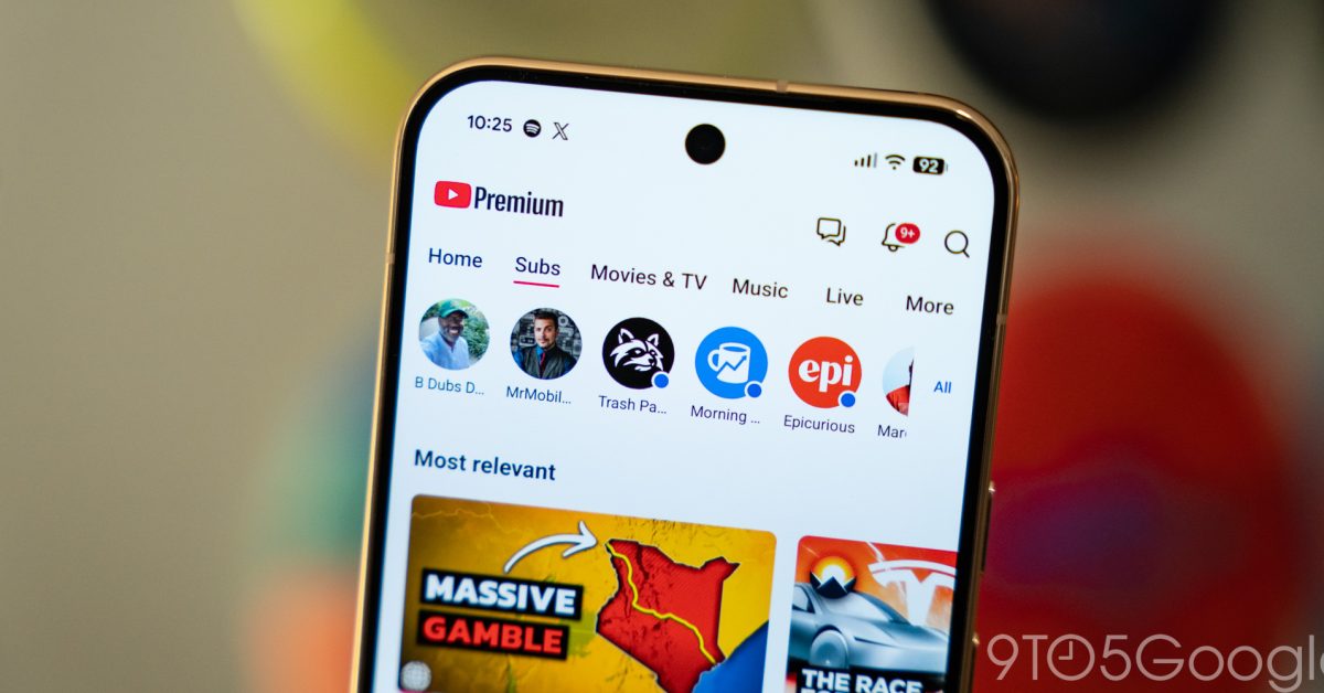
After the change was announced last month, YouTube is now rolling out its mobile app redesign with a new navigation bar and no dedicated Subscriptions tab and initial reactions tell a pretty clear story – everyone hates it. In its biggest change in around a decade, YouTube’s mobile app is ditching its five-button navigation bar for a new look that focuses on Shorts and creation, with a new “Home” page that includes recommendations, “Subs,” and more. The biggest change here is that YouTube no longer has a dedicated Subscriptions tab in its app, with that now a swipe away on the new “Home” tab. Functionally, it’s not all that different, but it breaks a decade of muscle memory and shuffles the priority of content in the app. We’re seeing the new YouTube redesign on Android today, with many also seeing it on iOS. It appears to be rolling out via a server-side change rather than a specific app update. User reactions are strong. “Sloppy,” “disgusting,” “the worst UI that has ever been made by Google.” The bulk of the blowback is on the removal of the Subscriptions tab in the YouTube app, with many annoyed that YouTube is now designed
Read More
YouTube rolling out app redesign without Subscriptions tab, and everyone hates it
YouTube rolling out app redesign without Subscriptions tab, and everyone hates it